One world.
Kai’s Cloud direction is the identity. The same five colours, selected wordmark and visual language hold everything together.
 CLOUD / BRAND BOOKVisit website ↗
KAI + ALEXIS / OCTOBER 2026
Direction 04. Chosen together.
A bright world for feeling good.
Juicy rituals. Full-of-life people.
Sky, blue, violet,
olive & butter.
One recognisable world.
01 / THE FOUNDATION
Well-being with warmth, flavour and personality. Afterglow belongs wherever people move, connect, make plans and take care of themselves.
Kai’s Cloud direction is the identity. The same five colours, selected wordmark and visual language hold everything together.
ENERGIZE · HYDRATE · UNWIND
Clear ways to find a ritual. They share our brand palette and are not assigned separate colour systems or times of day.
Our starting audience hypothesis: socially curious, visually aware adults around 25–40 with spending room for premium wellness. Test that with customers, rather than treating it as a rule.
02 / KAI’S CLOUD PALETTE
These five colours come directly from option 4. Sky and blue set the scene; violet brings the spark; olive and butter give it warmth and balance.
Our open, optimistic canvas. Broad fields, generous space and graphic cloud shapes.
Depth and recognition. Photography overlays, large graphic forms and secondary surfaces.
The electric accent. Buttons, expressive headlines and a bold full-bleed moment.
Our grounding ink. Body copy, detailed information and a calm contrast to the bright colours.
Warmth and breathing room. Quiet backgrounds and the light version of our wordmark.

Let a bold field do the work.
Olive on butter or white for reading. White on violet or olive for buttons. Sky and blue work beautifully as graphic surfaces.
White is a functional neutral. Lemon yellow belongs to the fruit; it doesn’t replace our palette. Use violet on sky for large graphics, not small body text. Check contrast for the actual text size.
03 / THE SELECTED WORDMARK
The lowercase lettering Kai selected: warm, rounded and full of character. Keep its proportions, spacing and distinctive letterforms intact.
The downloadable SVG follows the contours of the selected raster artwork. It is a contour trace, not a retyped substitute. Leave at least the height of the lowercase “a” around the mark; don’t stretch, outline or add effects to it.
Download olive SVG ↓ · Butter SVG ↓Cranwich Medium / Fridaytype is the leading WhatTheFont match; Burkey Medium is the next candidate. The PDF contains a raster logo, with no original font metadata. Neither is a confirmed exact match, so the selected artwork remains our source of truth.
Inspect Cranwich ↗ · Selected source artwork ↗04 / THE SUPPORTING VOICE
Three supporting sans-serif options. The wordmark stays fixed. Preview a font to see the book’s headings, navigation and body copy change together.
Stay juicy.
Feel like yourself.
Recommended. Open, warm and clear; enough character for a bright headline, enough restraint for product details.
Electrolytes · 30 servings
Clear ingredients. A ritual that fits your life.
Stay juicy.
Feel like yourself.
Crisp and direct. A clean supporting voice for a more contemporary, functional shop.
Electrolytes · 30 servings
Clear ingredients. A ritual that fits your life.
Stay juicy.
Feel like yourself.
Soft and familiar. A friendly alternative with an easy rhythm for longer reading.
Electrolytes · 30 servings
Clear ingredients. A ritual that fits your life.
Electrolytes, fresh flavour and a ritual that fits your plans.
Stay juicy ↗Headlines
Weight 600. Short, direct and generously sized.
Body
Weight 400. 16–18px, line height around 1.5. Keep longer copy to a comfortable reading width.
Details
Weight 500. Plain product names, clear ingredients, useful labels. Reserve all caps for short navigation and captions.
All three supporting fonts are self-hosted with their open licences. No commercial candidate font is embedded.
05 / THE MAIN SQUEEZE
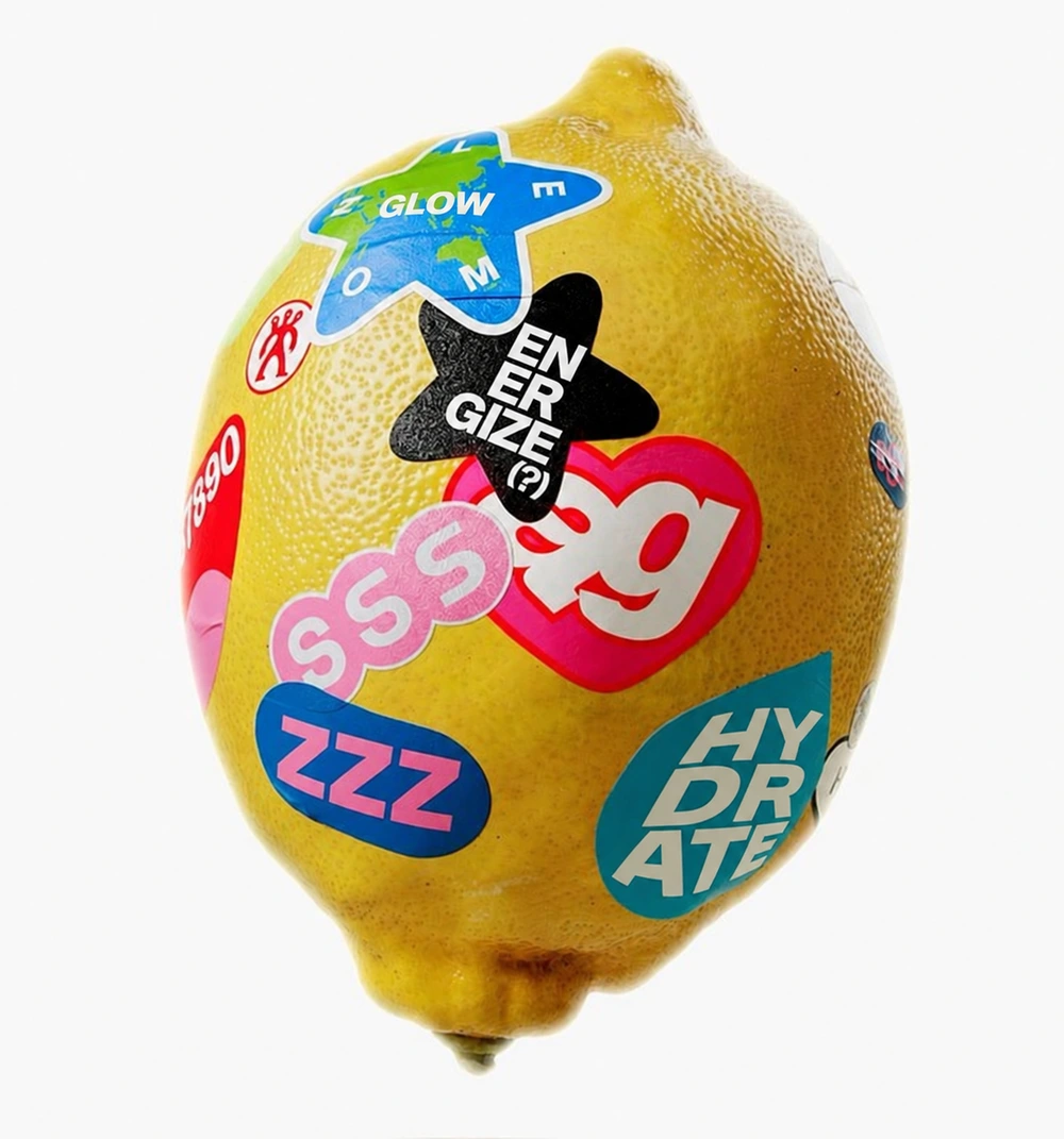
Keep the original shapes, positions, overlaps and exposed yellow peel. Adapt wording where it fits. The variety lives inside the existing composition.
Natural lemon colour and texture stay. Sticker colours keep the reference’s playful variety; surrounding brand design uses Cloud.
Open the video reference ↗This is the original rendered video, not an editable 3D model. Its wording is unchanged. The pin does not expose the mesh, UV map or source project needed for a faithful text-only edit across every angle.
Download the precise 3D handoff ↓Compare against the original. The right-hand image is an AI text-edit study, not a finished 3D texture.
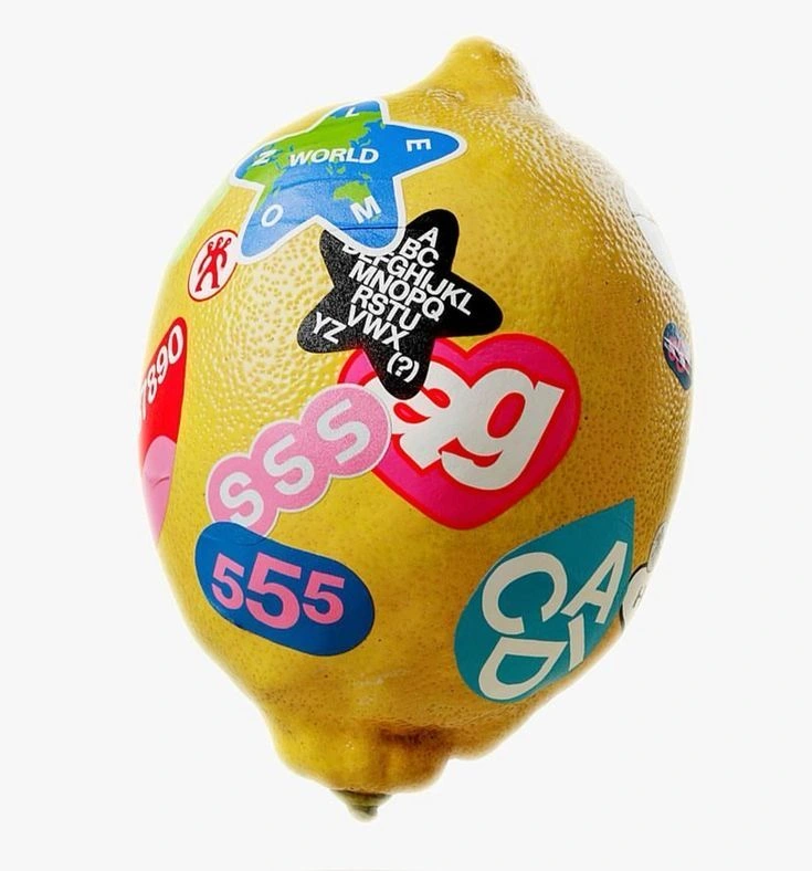
Keep the central “ag” heart and linked SSS circles. Proposed edits: WORLD → GLOW; alphabet star → ENERGIZE; 555 → ZZZ; teal lettering → HYDRATE. UNWIND can replace a suitable label on the back once the editable source is available.
06 / HOW THE WORLD LOOKS
Graphic cloud shapes, tactile fruit, clear typography and a real product in view. Confident compositions with one main idea, rather than layers of decoration.
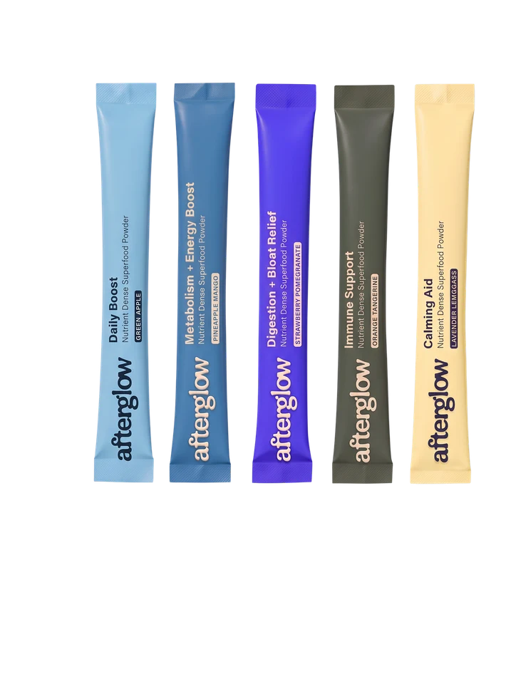
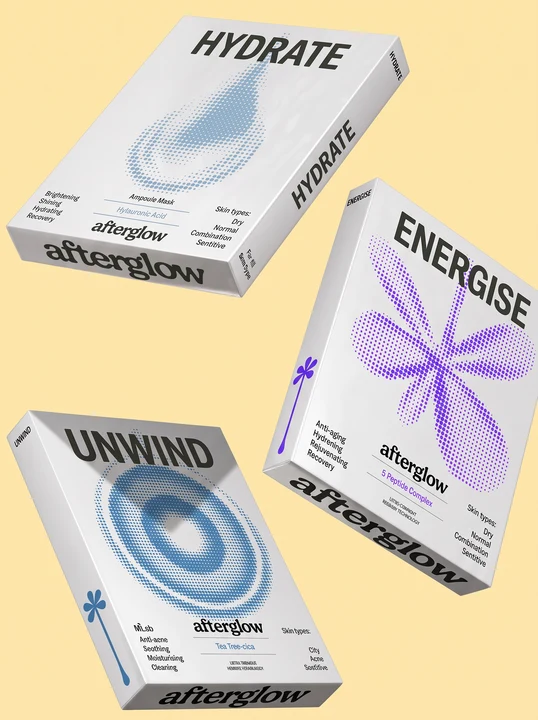
Original concepts extracted from Kai’s visual-direction PDF. Illustrative packaging, not finished labels or available products. The selected lowercase wordmark supersedes other lettering visible in these concept packs.
A broad colour field, a strong headline and one focal object. Use organic masks or a cloud shape with purpose. Leave space around the wordmark and information.
Real-looking peel, water, powders, people and packaging. Bright light, honest texture, close sensory details. The product should feel tangible.
Alternate product proof, fruit/flavour and people. Keep the five colours and one type pairing consistent while testing different audiences and content angles.
07 / THE WORDS FEEL IT TOO
Lead with the feeling, then make the product information clear. Sensory, social and confident. “Orgasmic” is our internal cue for delight, not a promised product effect.
The clearest brand platform: optimistic, memorable and broader than any single product.
Feel-good rituals. Full-of-life people.
Make it a blue-sky day.Brings the habit into the headline. Useful when we need to explain what Afterglow is about.
Energize. Hydrate. Unwind. Find your kind of glow.
Find your ritual.A more playful campaign line. Especially strong alongside fruit, flavour and people.
Everyday wellness with a taste for the good stuff.
Get into your glow.Active verbs, sensory details and warm invitations. Playful doesn’t mean babyish. Say “Stay juicy.” Say “Your water’s new plus-one.” Skip guilt, fear, cutesy diminutives and wellness homework.
Ingredient names, doses and benefits must match the actual product evidence. Use “Science-backed rituals for blue-sky days” only when the specific formulas and claims justify it. Never imply safe drug use or guaranteed hangover prevention.
08 / READY TO USE
The selected wordmark in four colours, exact palette files, supporting fonts with licences, and the mascot production brief.
Identity: Kai’s “AfterGlow: Visual Direction and Exploration”, option 4 / Cloud, page 5; selected wordmark, page 6. The selected lettering is supplied as raster artwork and preserved through a contour trace.
Mascot: original still and rotation reference. The source clip remains unmodified. The text-edited still was made with built-in image generation; it does not establish an editable 3D source.
Fonts: official Google Fonts / designer distributions; OFL licences included. Cranwich is a candidate identification only and is not included in the kit.
Kai’s curated mood board ↗The original site and its subpages, with Harbour restored.