People with plans.
For people who move, connect and enjoy their lives. Our starting audience hypothesis is socially curious, visually aware adults around 25–40, with room for premium everyday wellness.
 02 / ZINGYVisit website ↗
Bright flavours. Warm energy. Everyday rituals with a taste for the good stuff.
Explore Zingy ↓The same Afterglow soul.
One juicy point of view.
Zingy makes flavour the first impression: juicy orange, electric citrus green and golden yellow, with small neutral areas for clarity. The emotional north star stays the same.
For people who move, connect and enjoy their lives. Our starting audience hypothesis is socially curious, visually aware adults around 25–40, with room for premium everyday wellness.
ENERGIZE · HYDRATE · UNWIND are product categories within one identity. This exploration does not bring back the sunrise-to-night system or assign a colour to each pillar.
Fitness, everyday care, festivals and social lives can all belong here. Keep the brand recognisable while testing which audience and rituals resonate.
The Zingy palette follows Kai’s board, with our brighter orange updated to #F06A3C on 28 October 2026. Dark brown and white are supporting neutrals.
A supporting neutral. Use sparingly; orange and citrus lead.
The punch. A campaign field, a large statement or a flavour-led graphic.
The sunny lift. Supporting surfaces and a warm contrast to orange.
The fresh counterpart to orange. Large colour fields, buttons and lively graphic moments.
The soft neutral. Quiet packaging and clean product information.
Lead with fresh orange and citrus fields, a bold headline and juicy fruit imagery. Keep cream, chalk and brown as supporting details rather than large earthy surfaces.
Keep body copy in dark ink on light surfaces. Use the bright tones as fields, accents and packaging options; don’t force a separate palette onto each product category.
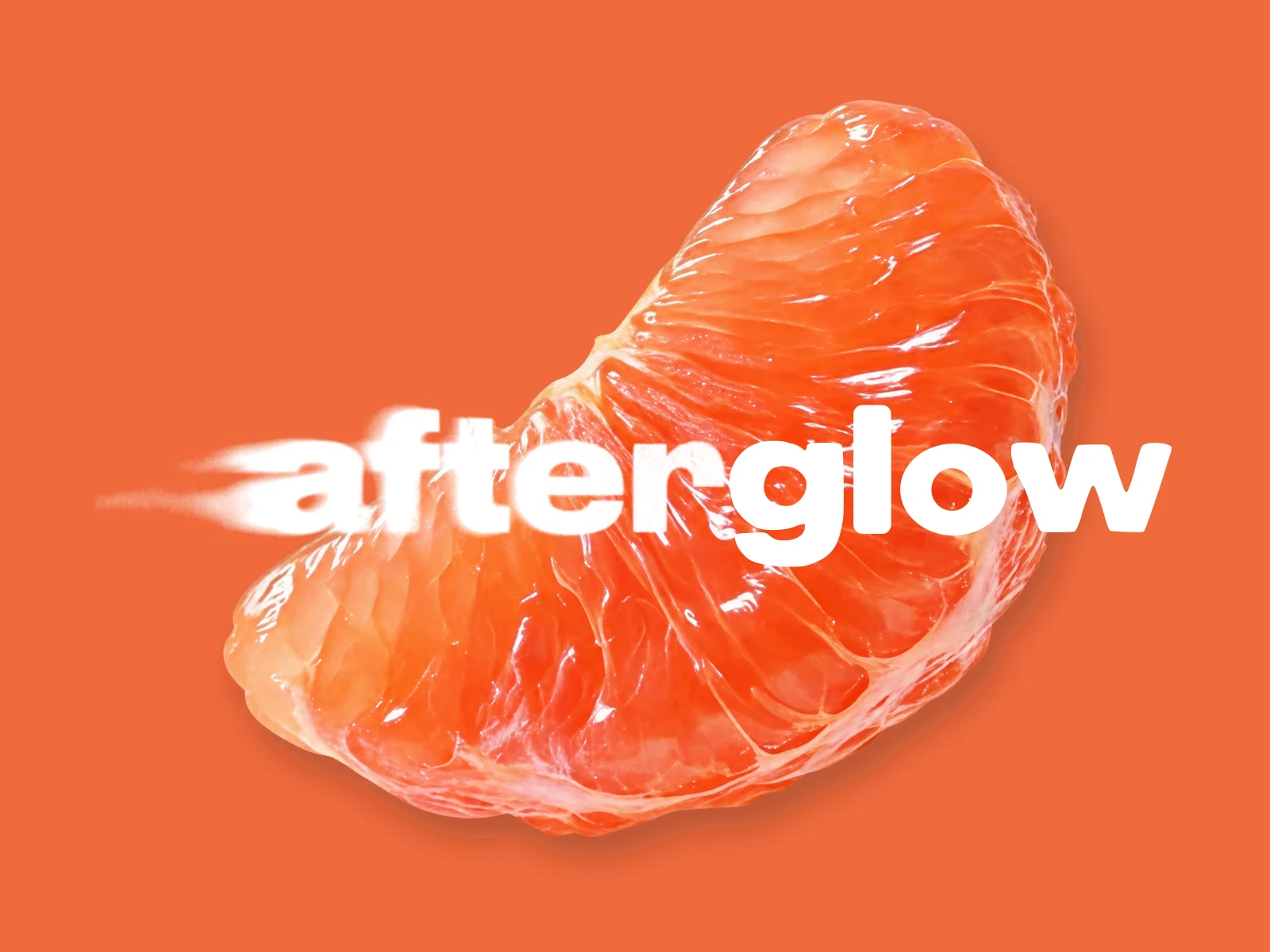
Our final lead composition: a juicy tangerine segment on #F06A3C orange, with the white Afterglow wordmark superimposed. Keep the left-side motion and the sharp “glow” finish. The fruit supplies the flavour; the name stays unmistakable.
These pairings explore the system. Orange and tangerine remain the approved primary; Fresh colours appear here as campaign concepts.
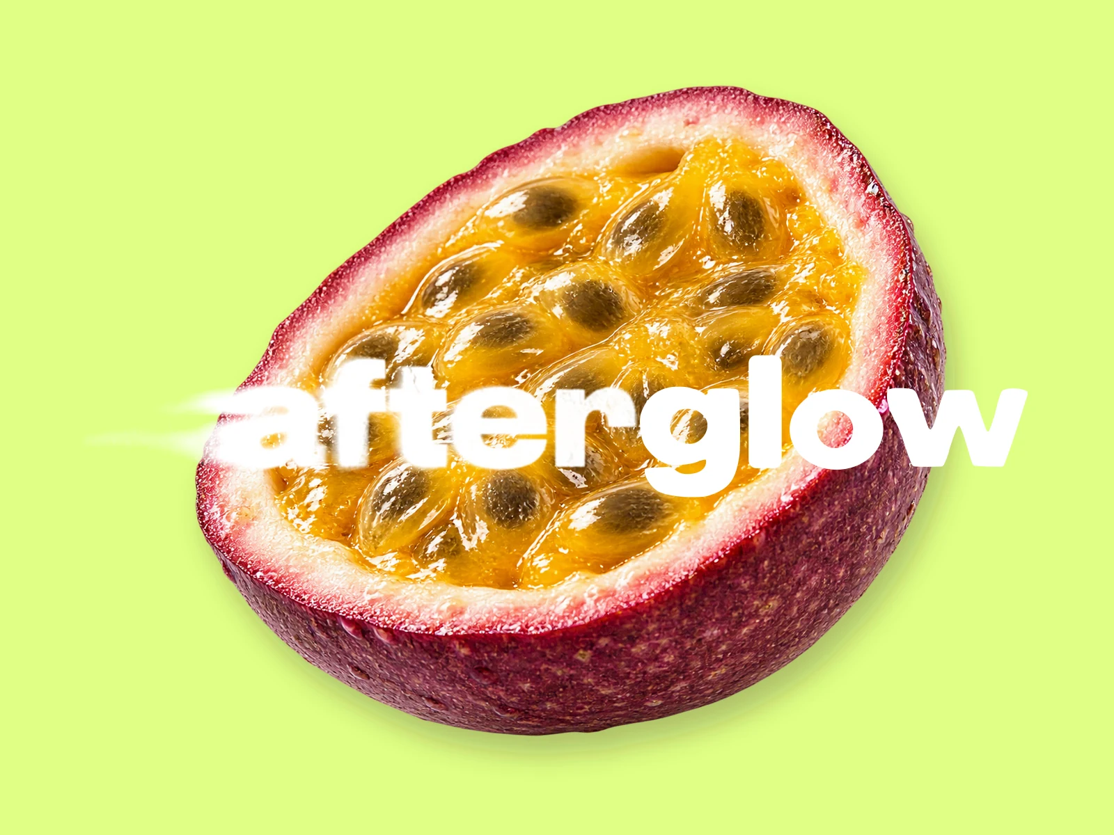
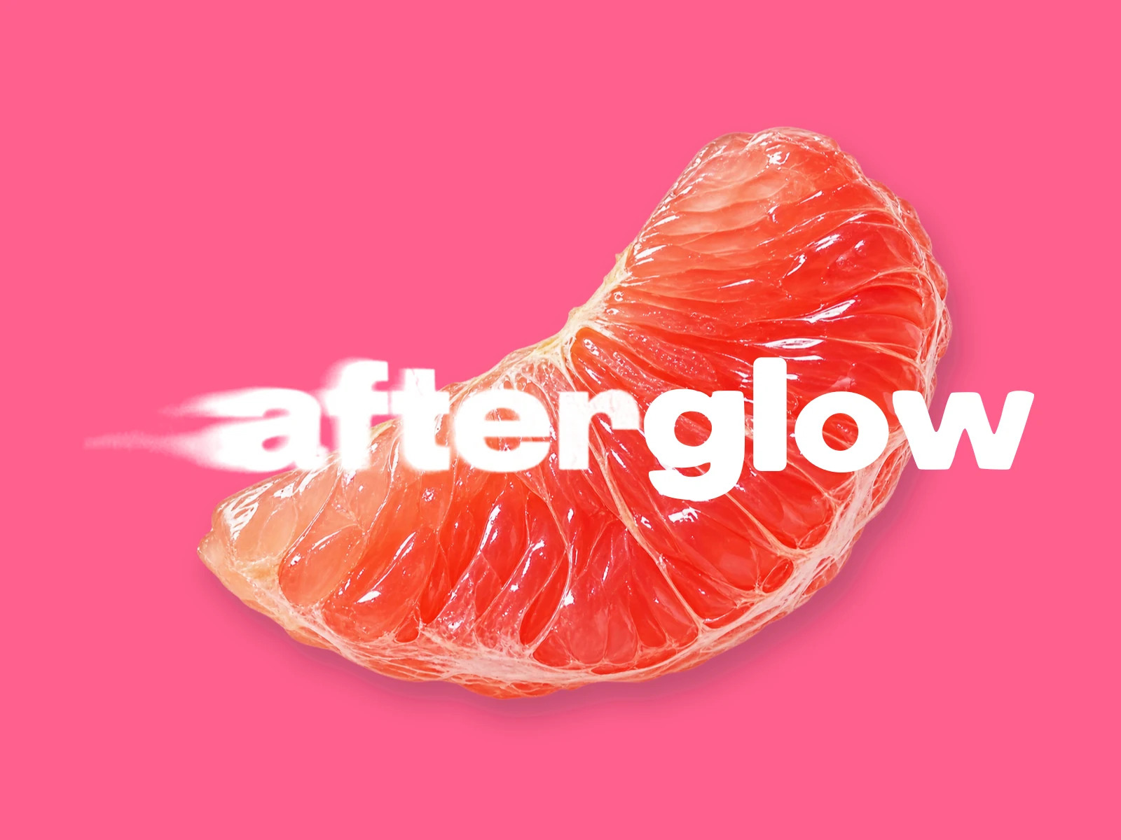
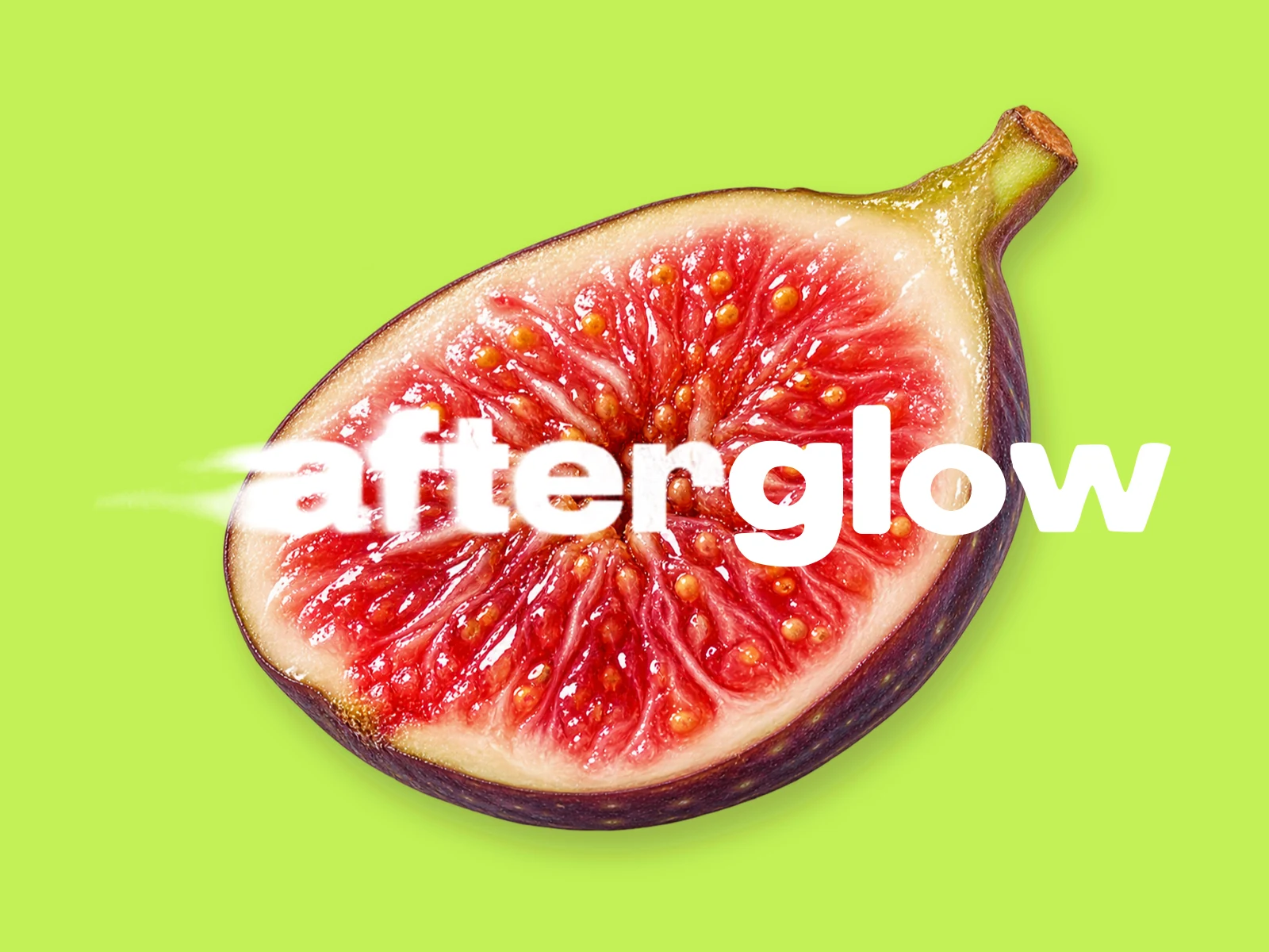
Use these simpler versions where the full fruit composition would compete with products or become too small.


Use the supplied wordmark above the fruit. Keep the trail, the gentle left-edge blur and the sharp “glow” intact. Never apply blur to the whole name, stretch it or rebuild it with a substitute font.
Leave clear space around the entire artwork, including the speed effect. At small sizes or in print, use the clean contour version so the name remains legible.
Clean dark SVG ↓ · Clean white SVG ↓The full fruit composition leads campaigns and large brand moments. Use the single-colour wordmark for navigation, light surfaces and small placements. Keep it above the fruit, and never cover the name with another object.
The starting recommendation here: clear, open and confident. It gives flavour-led headlines a strong rhythm and keeps ingredients and product details readable. Try the three supporting fonts below; the wordmark never changes.
Playful supplements and everyday rituals.
Find your kind of glow.
Headlines
600 weight. Short, confident statements with generous scale.
Body & product details
400–500 weight, 16–18px and comfortable line spacing. Ingredient names and instructions stay clear.
Our signature
The approved motion wordmark is supplied artwork, not a body font. Its left-side softness ends before the sharp “glow”.
The original Zingy sachet and box explorations, extracted from Kai’s PDF. These are historical packaging concepts; the current orange and fruit-overlaid motion identity shown above supersede their earlier lettering and colour values.
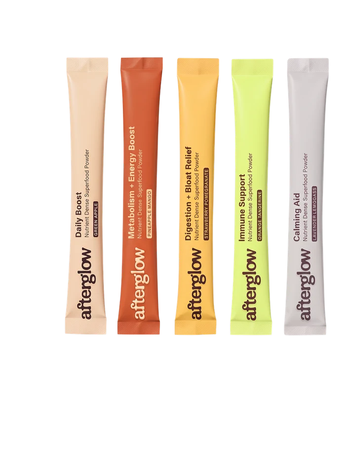
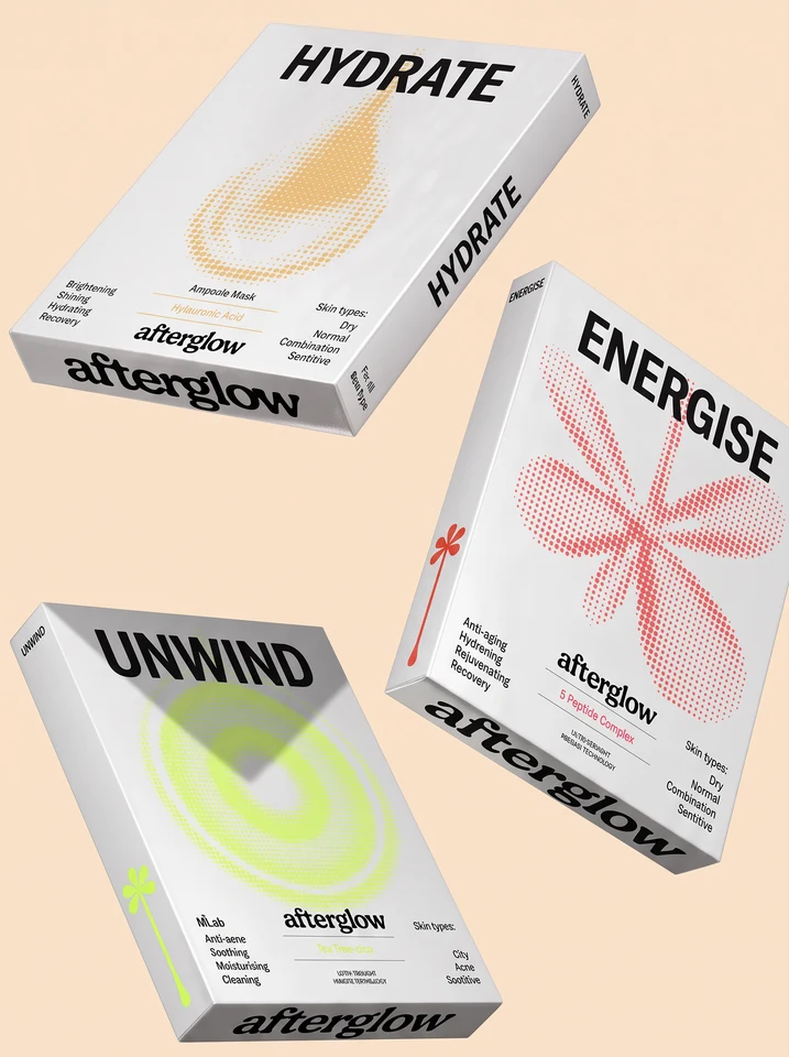
Concept packaging, not approved labels or available products. Other lettering or graphic marks in these source mockups are part of the original exploration; the selected wordmark and fruit identity remain the shared current decisions.
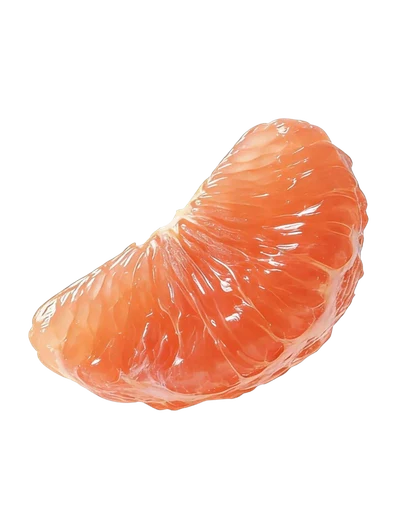
Backlit citrus, tactile ginger, a satisfying pour and real-looking product texture. Close enough to make the flavour feel tangible.
Keep real products, people and sensory details in the frame. The graphic identity should make the product feel more tangible.
Sweet orange and tangerine segments, exposed juicy flesh, drops, pours and tactile macro textures. Superimpose one photographic segment across a colour field or product composition, as in Kai’s original board.
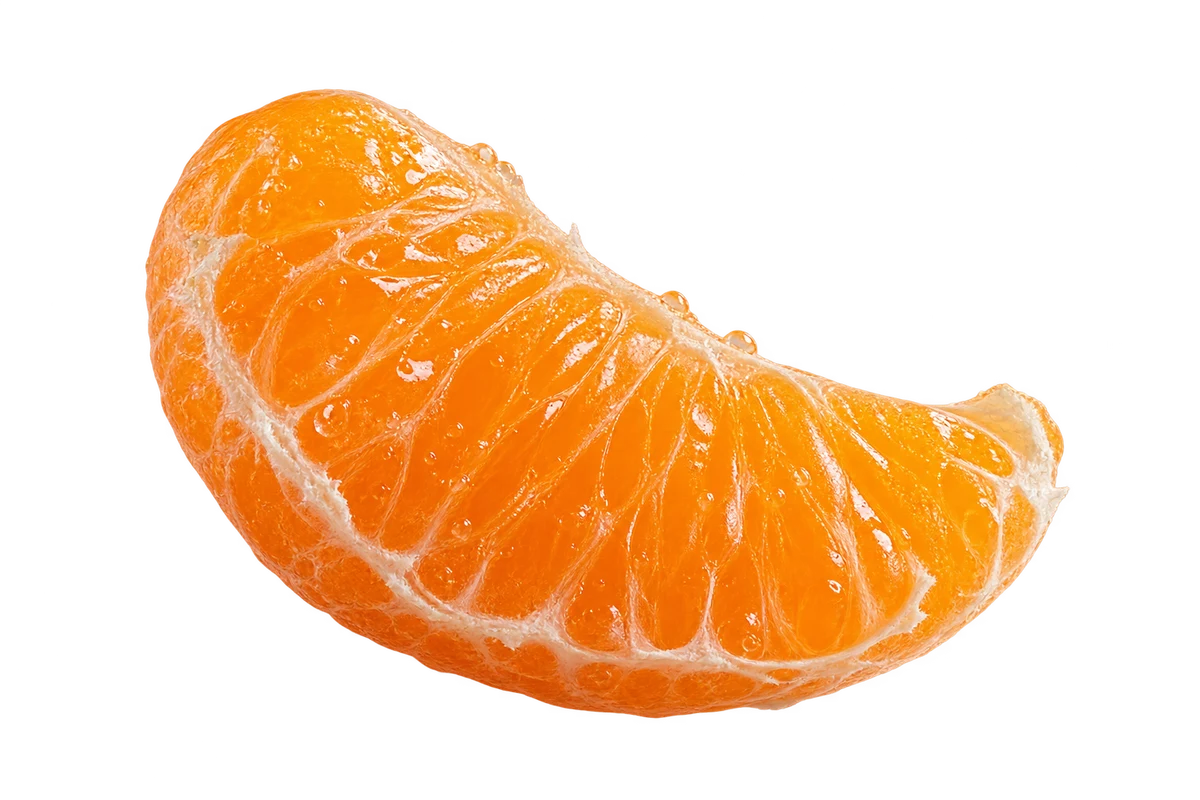
Use a segment as an expressive photographic element. Whole fruits can support the story, but the open, juicy interior is our signature. No stickers or faces.
The supplied clean wordmark leads navigation. Our favicon is the initial taken directly from that artwork; the full fruit composition leads social and large brand moments.
Lead with “Stay juicy.” Explain the product and how to choose it. Keep the three pillars as product categories. No sky or sunrise-to-night story.
Bright, fresh and adult. Orange and citrus lead; cream, chalk and brown stay in supporting roles. Avoid a muted autumn look or a corporate orange interface.
Fruit and liquid photography expresses the brand; it does not imply every formula contains fresh fruit or that every product is orange flavoured.
The same warm, adult, knowing voice. More sensory detail and confident invitations; less wellness homework.
The primary line: immediate, sensory and paired with exposed tangerine flesh.
Shop the good stuff.The most natural fit for flavour, fruit and full-of-life people.
Get into your glow.Short, confident and broad enough for the whole range.
Find your ritual.A campaign line for the social side of Afterglow.
Bring your kind of energy.Use pleasure and flavour to express the brand. Product benefits still need evidence for the actual formula and dose. “Orgasmic” is an internal cue for sensory delight, not a promised physiological effect.
The approved Afterglow identity. Fresh orange, electric citrus and a tangible, juicy world — built around making supplements simple.
Based on Kai’s “AfterGlow: Visual Direction and Exploration”, direction 02, page 3. Packaging concepts and the original palette come from that board; orange was updated to #F06A3C on 28 October 2026, and the approved motion logo comes from the founders’ supplied reference; the supporting layout, type recommendation and copy are an extension for comparison.
The motion wordmark supersedes the earlier Cloud lettering. It is reconstructed from the founder-approved reference: original left-side softness, with sharp vector contours across “glow”. Original photographic references and packaging concepts are excluded from the downloadable kit. Newly generated fruit concepts are labelled as such, with the prompts recorded in the authoring source. The kit includes current palette files, motion and clean SVG masters, the primary fruit composition, three campaign concepts and the usage guide.
Status: approved. Chosen by Kai and Alexis on 27 October 2026. No sunrise-to-night narrative or pillar-specific colour coding is introduced.

A feed
with bite.
A nine-tile composition study using the Zingy palette, live typography and Kai’s original reference imagery. Product, feeling and flavour share the same visual world.
for
living.
company.
Great plans.Make it your kind of day.
juicy.
A layout and colour study, not a published Instagram feed. The packaging remains illustrative. The fruit concepts in the identity section use AI-generated photographic cutouts, composited with the supplied wordmark.
One focal point.
Let each post carry one clear idea. Use a strong product image, an ingredient detail, a face or a short statement.
Variety with a thread.
Repeat the palette and type pairing. Vary scale, crop and subject so the grid feels alive without becoming a rigid template.
Feeling meets clarity.
Lead with sensory appeal. Make the format, product name and relevant facts easy to understand when people want to know more.