People with plans.
For people who move, connect and enjoy their lives. Our starting audience hypothesis is socially curious, visually aware adults around 25–40, with room for premium everyday wellness.
 01 / FRESHApproved Zingy ↗
A fresh take on feeling good. Crisp lime, juicy pink and soft, tactile moments.
Explore Fresh ↓The same Afterglow soul.
A different visual point of view.
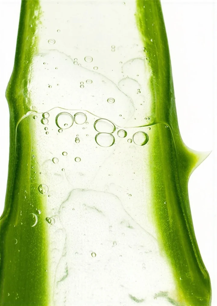
Fresh puts a clean, sensory spin on Afterglow: bright lime and pink held in balance by muted blue-grey and soft neutrals. The emotional north star stays the same.
For people who move, connect and enjoy their lives. Our starting audience hypothesis is socially curious, visually aware adults around 25–40, with room for premium everyday wellness.
ENERGIZE · HYDRATE · UNWIND are product categories within one identity. This exploration does not bring back the sunrise-to-night system or assign a colour to each pillar.
Fitness, everyday care, festivals and social lives can all belong here. Keep the brand recognisable while testing which audience and rituals resonate.
All five colour values come directly from Kai’s Fresh board. The near-black reading ink and white are practical supporting neutrals.
The crisp signature. A focal panel, a graphic shape or a bright call to action.
The balancing tone. Calm surfaces, packaging and secondary graphic fields.
A juicy accent. Short statements, expressive details and campaign moments.
A warm soft surface. Use it to give lime and pink breathing room.
The quiet neutral. Ground the photography and longer reading.
Use broad, quiet backgrounds and one sharp pop of lime or pink. Let the product or ingredient take the lead, with rounded shapes and generous space.
Keep body copy in dark ink on light surfaces. Use the bright tones as fields, accents and packaging options; don’t force a separate palette onto each product category.
The selected lowercase wordmark stays constant across this comparison. Its warmth and character connect Fresh to the Afterglow we’ve already chosen.

Use the selected artwork, keep its proportions and spacing, and leave clear space around it. These SVGs are colour variants of the contour-traced master, not a new typeset logo.
Download dark SVG ↓ · Reverse SVG ↓The natural yellow lemon and its reference-matched sticker arrangement can sit within either palette. Fruit gives us flavour, texture and variety; it doesn’t require a new mascot design for each direction.
See the approved lemon direction ↗The starting recommendation here: warm, clean and easy to read. Its softness fits the pastel fields while leaving the selected wordmark room to play. Try the three supporting fonts below; the wordmark never changes.
Playful supplements and everyday rituals.
Find your kind of glow.
Headlines
600 weight. Short, confident statements with generous scale.
Body & product details
400–500 weight, 16–18px and comfortable line spacing. Ingredient names and instructions stay clear.
Our signature
The selected soft-serif wordmark stays artwork, not a body font.
The original Fresh sachet and box explorations, extracted from Kai’s PDF. These show how the palette can travel onto a physical object.
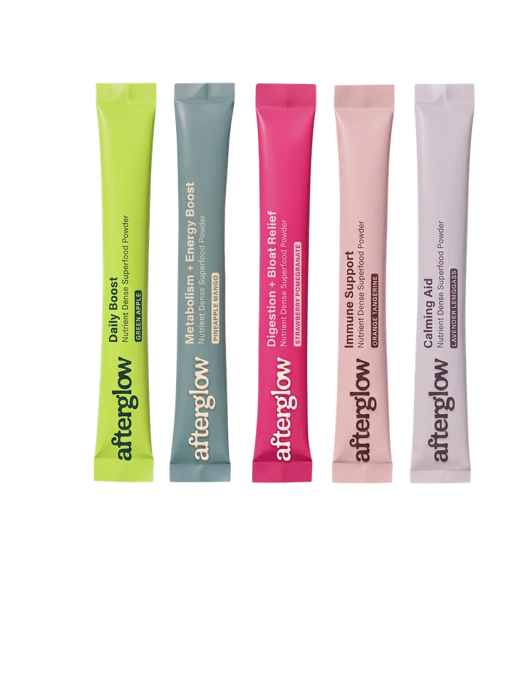
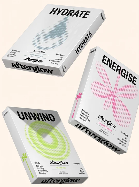
Concept packaging, not approved labels or available products. Other lettering or graphic marks in these source mockups are part of the original exploration; the selected wordmark and fruit identity remain the shared current decisions.
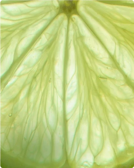
Dew on peel, translucent fruit, soft daylight and close-up texture. Keep the composition clean enough to feel refreshing.
Keep real products, people and sensory details in the frame. The graphic identity should make the product feel more tangible.
The same warm, adult, knowing voice. More sensory detail and confident invitations; less wellness homework.
The main direction line. A short, sensory invitation.
Find your fresh.A clearer explanation of the habit behind the brand.
Find your ritual.The shared Afterglow line still works in this palette.
Make it a blue-sky day.Use pleasure and flavour to express the brand. Product benefits still need evidence for the actual formula and dose. “Orgasmic” is an internal cue for sensory delight, not a promised physiological effect.
A separate reference for curiosity and comparison. Sharing this page does not change the approved Zingy identity or the live website direction.
Based on Kai’s “AfterGlow: Visual Direction and Exploration”, direction 01, page 2. Palette values and packaging concepts are taken from that board; the supporting layout, type recommendation and copy are an extension for comparison.
The selected wordmark remains the same contour-traced master as Cloud. All photographic references and original packaging concepts belong to their respective creators and are excluded from the downloadable kit. The kit includes palette files, wordmark colour variants and a short usage guide.
Status: alternative, not approved. Option 02 / Zingy is the current identity. No sunrise-to-night narrative or pillar-specific colour coding is introduced.
Fresh in
the feed.
A nine-tile composition study using the Fresh palette, live typography and Kai’s original reference imagery. Product, feeling and flavour share the same visual world.
feels
good.
Full-of-life people.
company.
Great plans.Make it your kind of day.
juicy.
A layout and colour study, not a published Instagram feed. The packaging remains illustrative. No additional AI imagery has been introduced.
One focal point.
Let each post carry one clear idea. Use a strong product image, an ingredient detail, a face or a short statement.
Variety with a thread.
Repeat the palette and type pairing. Vary scale, crop and subject so the grid feels alive without becoming a rigid template.
Feeling meets clarity.
Lead with sensory appeal. Make the format, product name and relevant facts easy to understand when people want to know more.